
Carding Forum
Professional
- Messages
- 2,788
- Reaction score
- 1,322
- Points
- 113
By eliminating these errors, banks could significantly improve the user experience.
Mobile finance: 7 sins of digital banking and how to avoid them.
In the 23 years since the launch of the first digital-only bank, Security First Network Bank, the digital banking experience has improved significantly. Nowadays, most banks and payment services have beautiful and responsive websites with a clean interface, easy search and intuitive navigation. However, the interface of digital banking itself often leaves a lot to be desired.
PaySpace Magazine has compiled the 7 most common "sins" in digital banking UX design and tips on how to avoid them.
1. Inaction on security issues
Problem: For more than two decades, perceived insecurity has been one of the main reasons customers abandon digital banking. This should also include privacy issues, because many users consider these concepts interchangeable.
Solutions:

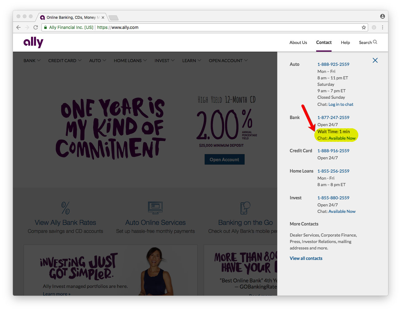
2. Hiding information about customer support
Problem: the bank knows exactly where it hid the contact information of the support service, but customers cannot always find it. Non-obviousness of such information may lead customers to think that the bank is deliberately trying to avoid contact with them.
Solutions:
3. Inconsistency between desktop and mobile versions
Problem: Most digital bank customers use both desktop and mobile versions of them. Moreover, their interfaces are often completely different. This mismatch degrades the user experience and leads to an increase in support requests.
Solutions:
4. Incomprehensible search
Problem: Google currently processes about 3.5 billion queries per day. With smart speakers rapidly gaining popularity, this number will only grow. Nevertheless, many financial institutions offer very primitive search sites. This is especially inconvenient in online banking, when the user is trying to complete a relatively simple task, and the search does not provide a clear solution.
Solutions:
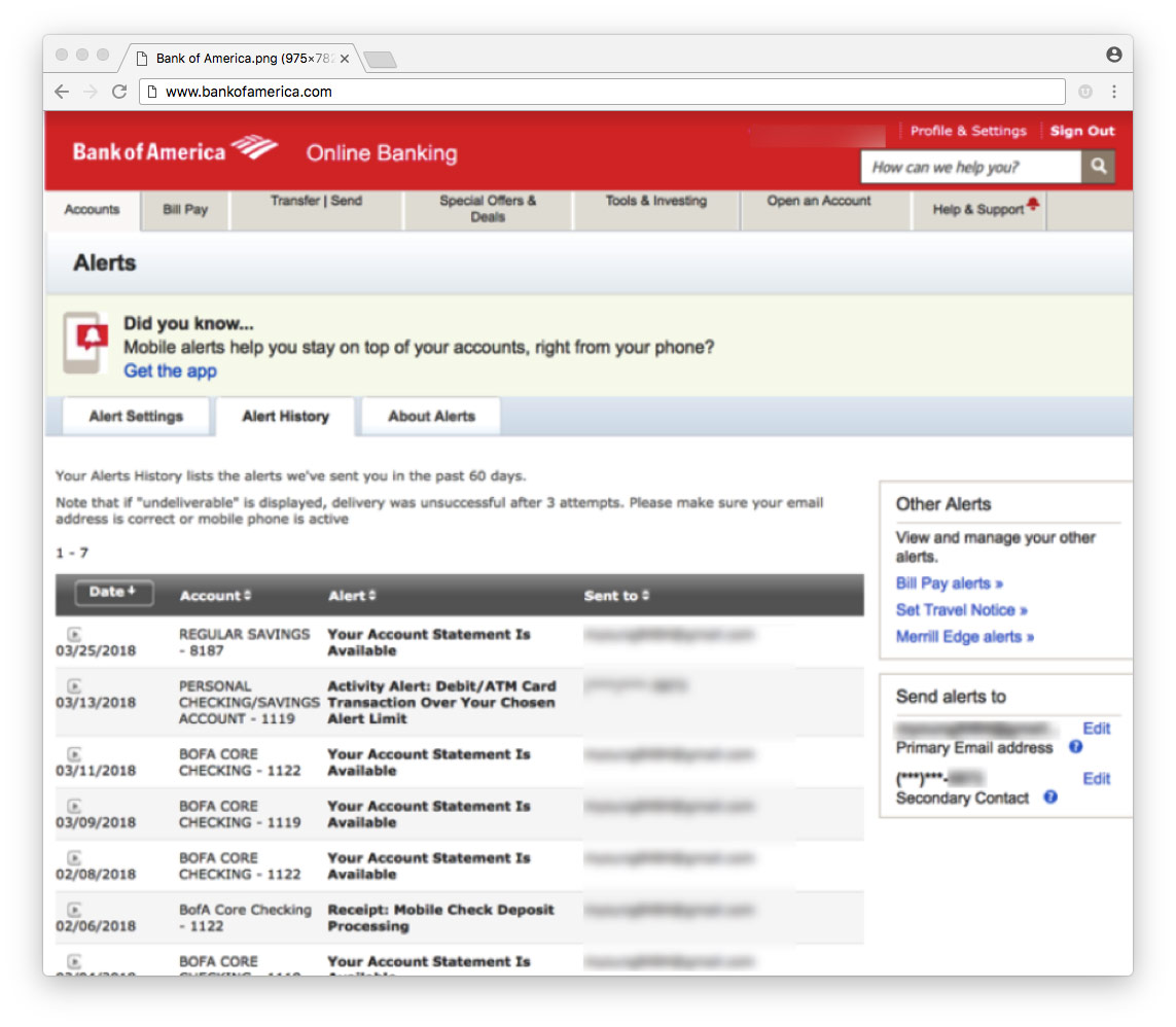
5. Problems with notifications
Problem: Notifications help reduce user stress when managing their own capital. However, the user sometimes does not understand where to find them, how to configure them or, in some cases, disable them.
Solutions:
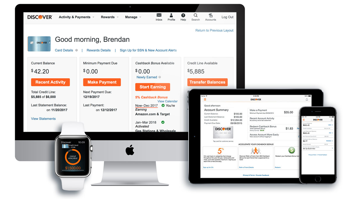
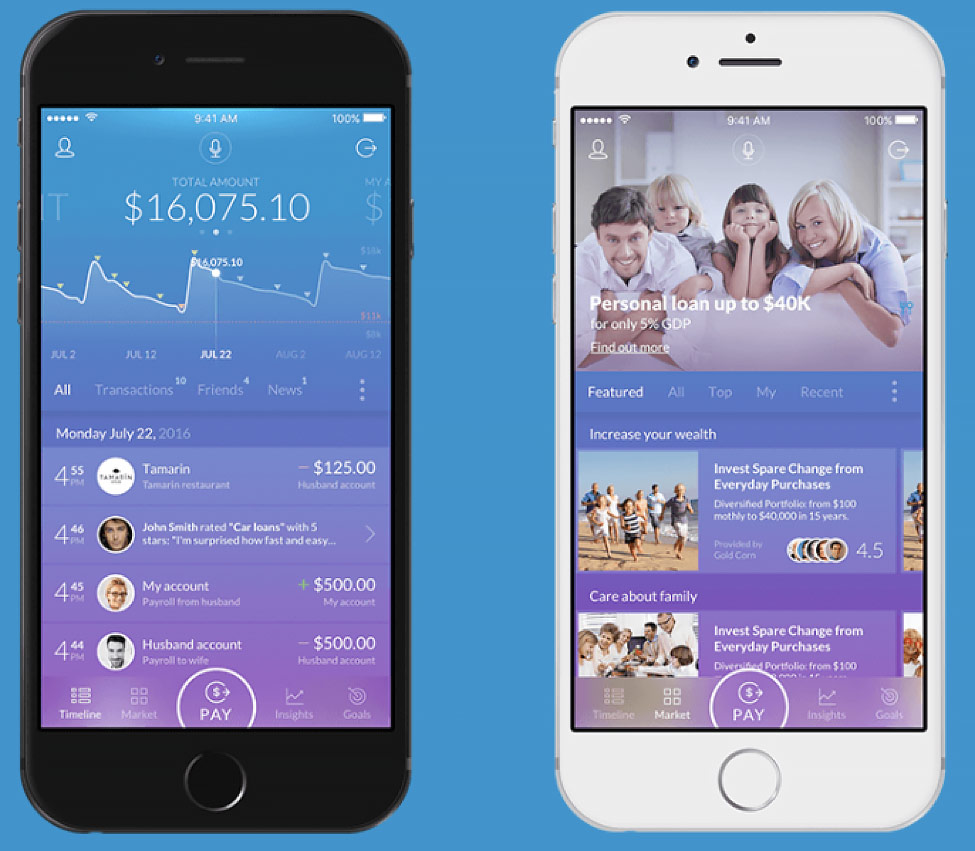
6. Complex presentation of transaction data
Problem: Financial institutions still display data in a format that is more suitable for a paper statement or spreadsheet.
Solutions:
7. One interface for everyone
Problem: Most financial institutions offer at least three checking account options. And some even more than a dozen. However, most digital banking clients are offered a completely identical experience. It's not good for an 80-year-old retiree to use the same interface as a freshman student. Moreover, banks are simply losing money, as many clients are willing to pay extra for personalized service.
Solutions:

Based on materials from thefinancialbrand.com
Mobile finance: 7 sins of digital banking and how to avoid them.
In the 23 years since the launch of the first digital-only bank, Security First Network Bank, the digital banking experience has improved significantly. Nowadays, most banks and payment services have beautiful and responsive websites with a clean interface, easy search and intuitive navigation. However, the interface of digital banking itself often leaves a lot to be desired.
PaySpace Magazine has compiled the 7 most common "sins" in digital banking UX design and tips on how to avoid them.
1. Inaction on security issues
Problem: For more than two decades, perceived insecurity has been one of the main reasons customers abandon digital banking. This should also include privacy issues, because many users consider these concepts interchangeable.
Solutions:
- Readable links to accessible language security and privacy materials
- Comprehensive guarantees of security and protection against fraud
- Links to third-party credit monitoring solutions
- Ability to enable two-factor authentication
- Visuals to improve login security
- The ability to "block" your account
2. Hiding information about customer support
Problem: the bank knows exactly where it hid the contact information of the support service, but customers cannot always find it. Non-obviousness of such information may lead customers to think that the bank is deliberately trying to avoid contact with them.
Solutions:
- Support contact / contact button on each page
- Structured forms that enable clients to better describe the problem
- Clear standards for answering calls and emails
- Online chat
3. Inconsistency between desktop and mobile versions
Problem: Most digital bank customers use both desktop and mobile versions of them. Moreover, their interfaces are often completely different. This mismatch degrades the user experience and leads to an increase in support requests.
Solutions:
- Build Similar User Interfaces for Desktop and Mobile Banking
- Using the same function names, standardizing navigation and design
4. Incomprehensible search
Problem: Google currently processes about 3.5 billion queries per day. With smart speakers rapidly gaining popularity, this number will only grow. Nevertheless, many financial institutions offer very primitive search sites. This is especially inconvenient in online banking, when the user is trying to complete a relatively simple task, and the search does not provide a clear solution.
Solutions:
- The search bar should appear on all pages
- Enabling the search by transactions option
- Natural language input capability
- Voice search
- Search hints for the most frequent queries
5. Problems with notifications
Problem: Notifications help reduce user stress when managing their own capital. However, the user sometimes does not understand where to find them, how to configure them or, in some cases, disable them.
Solutions:
- Integration of notifications for all digital banking functions
- Providing notification history
- Provides recommendations for customizing notifications, including optimal defaults
- Making it easier to customize notifications
6. Complex presentation of transaction data
Problem: Financial institutions still display data in a format that is more suitable for a paper statement or spreadsheet.
Solutions:
- Simplify tracking transactions and identifying suspicious activity. It should look more like Gmail than Excel.
7. One interface for everyone
Problem: Most financial institutions offer at least three checking account options. And some even more than a dozen. However, most digital banking clients are offered a completely identical experience. It's not good for an 80-year-old retiree to use the same interface as a freshman student. Moreover, banks are simply losing money, as many clients are willing to pay extra for personalized service.
Solutions:
- Provide unique interfaces for key segments: children, retirees, small businesses, students, etc.
- Charge additional fees for a wider range of security options
- Offer a higher level of service to customers who are willing to pay extra for it
Based on materials from thefinancialbrand.com